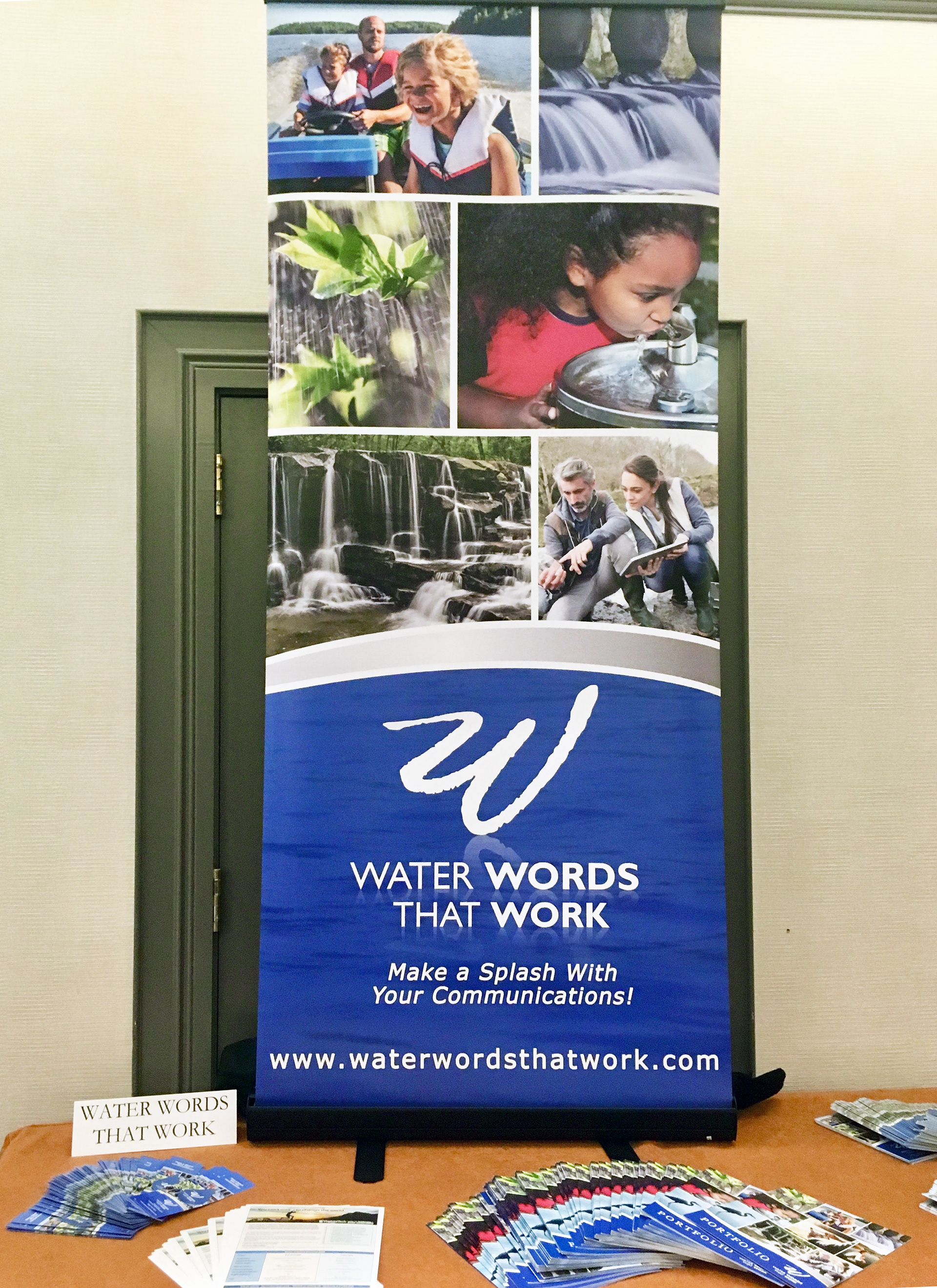
WWTW Table at the Choose Clean Water Conference in Baltimore, MD
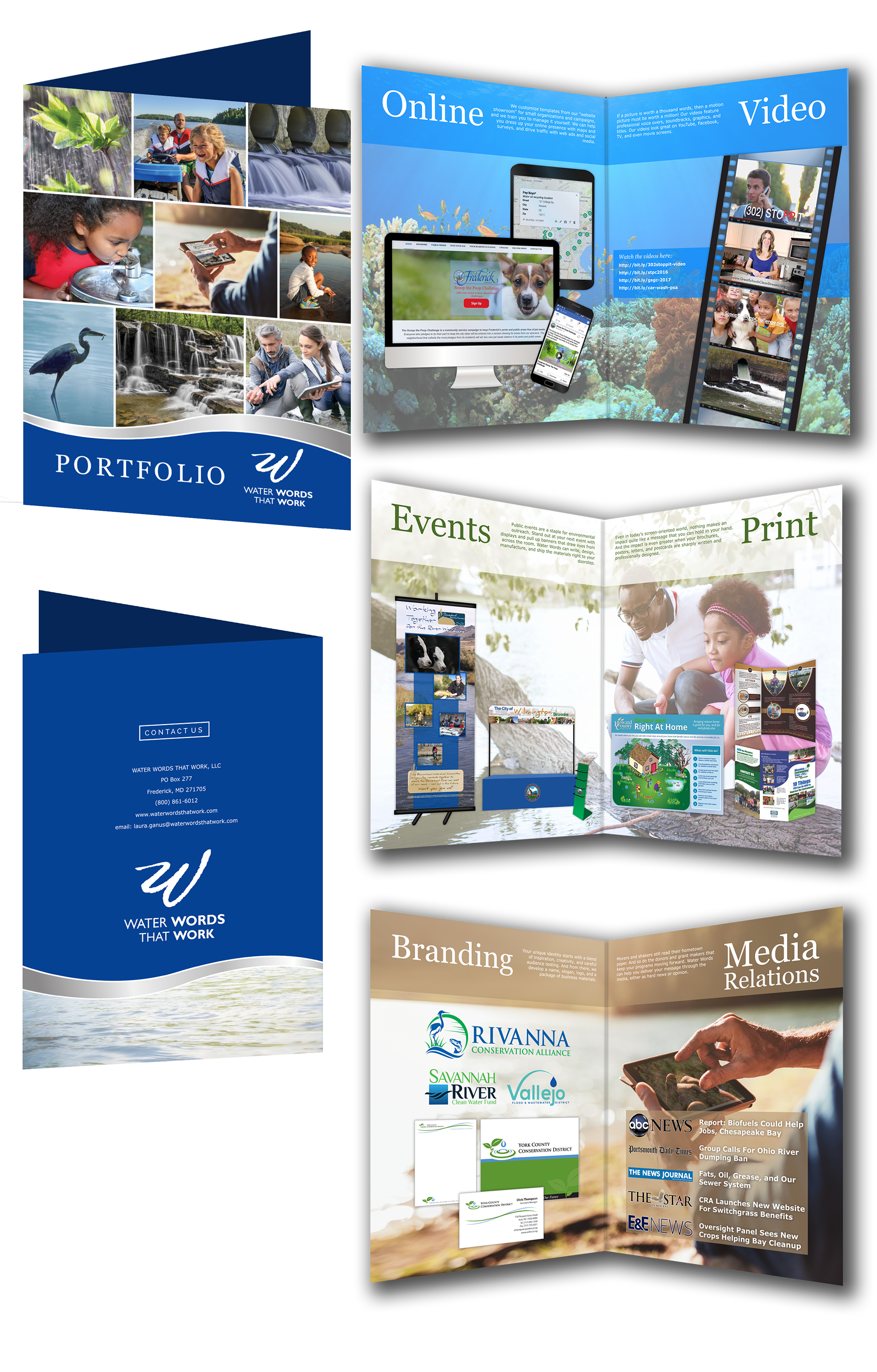
Custom Portfolio Layout for Water Words That Work (Lucidpress/Adobe Photoshop)
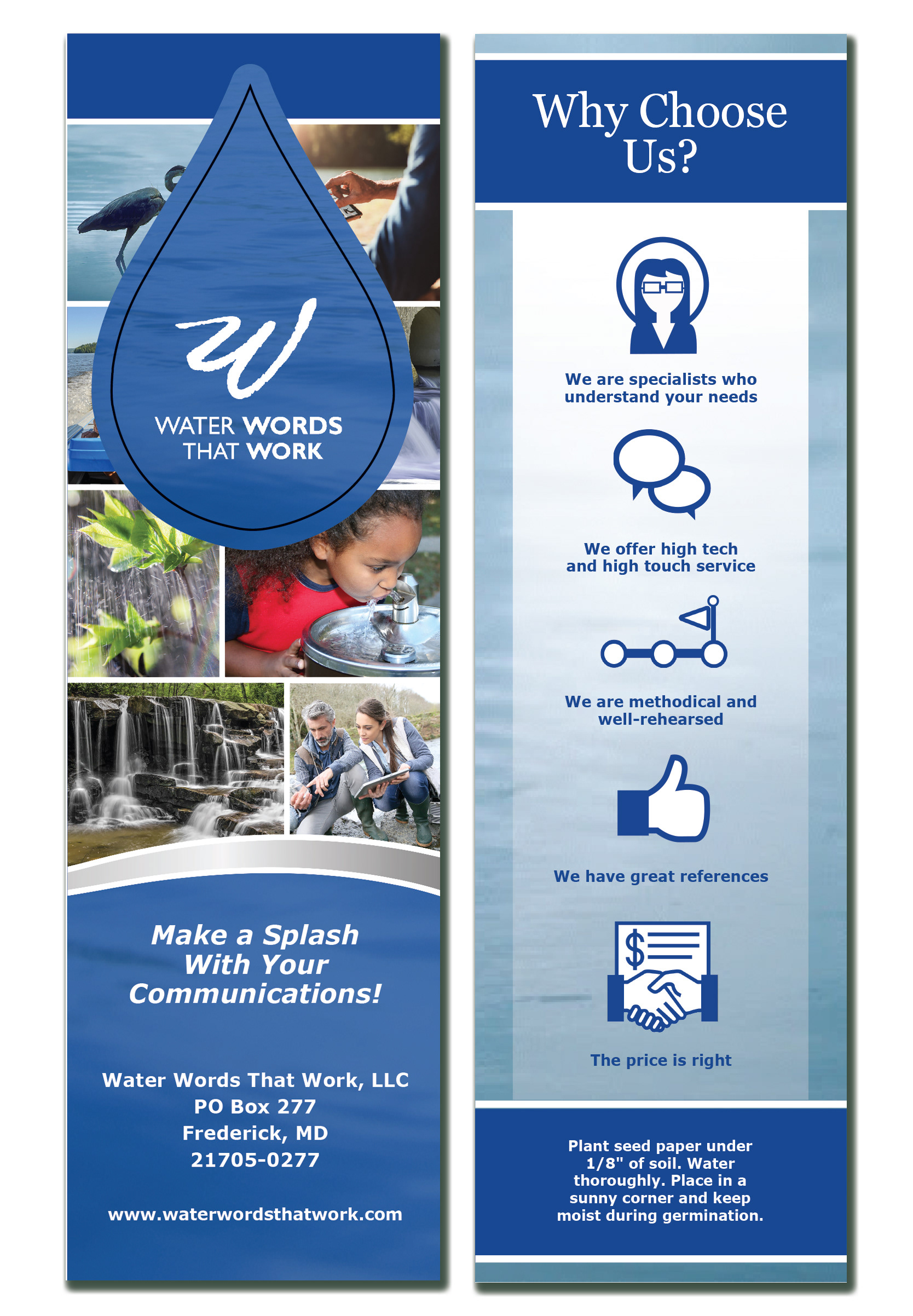
Custom Plantable Bookmarks (Detachable water droplet is made of seed paper) (Adobe Photoshop/Illustrator)
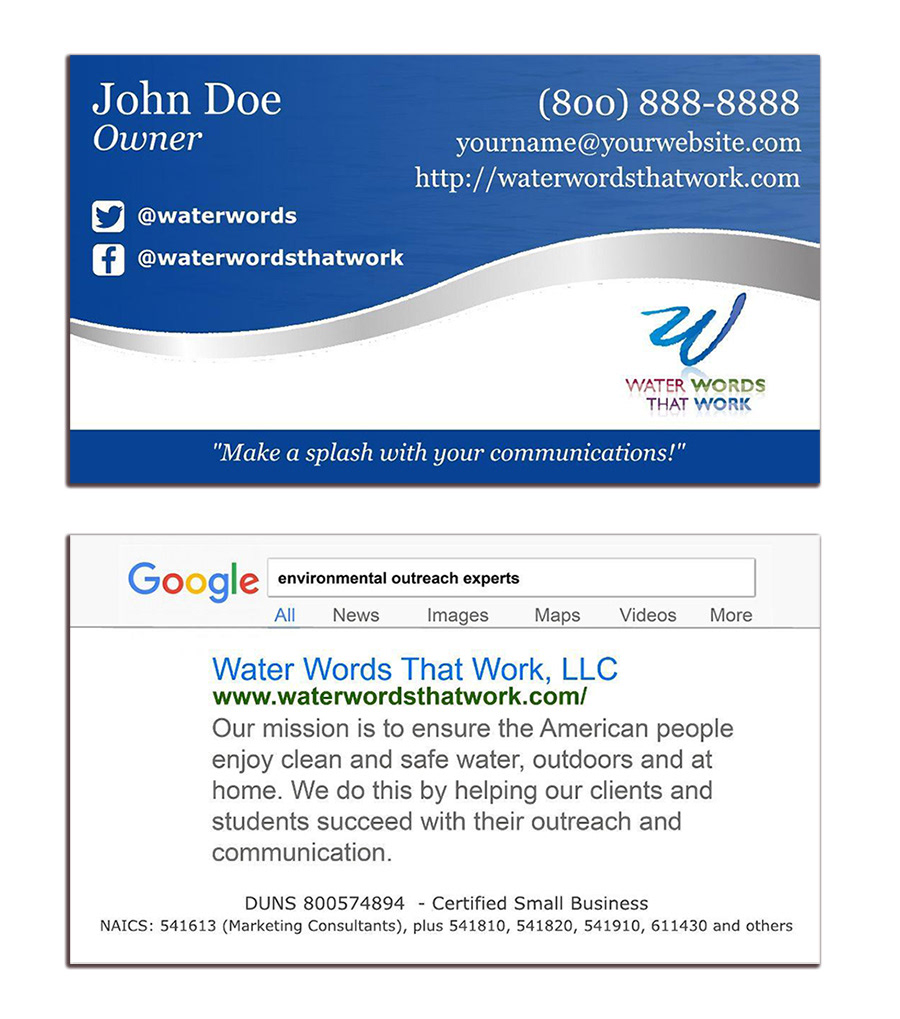
Business Card for Water Words That Work (Adobe Illustrator/Lucidpress)

Brochure options for Water Words That Work (Lucidpress/Adobe Photoshop)

Slide Deck Templates for Water Words That Work (Google Slides/Adobe Photoshop)
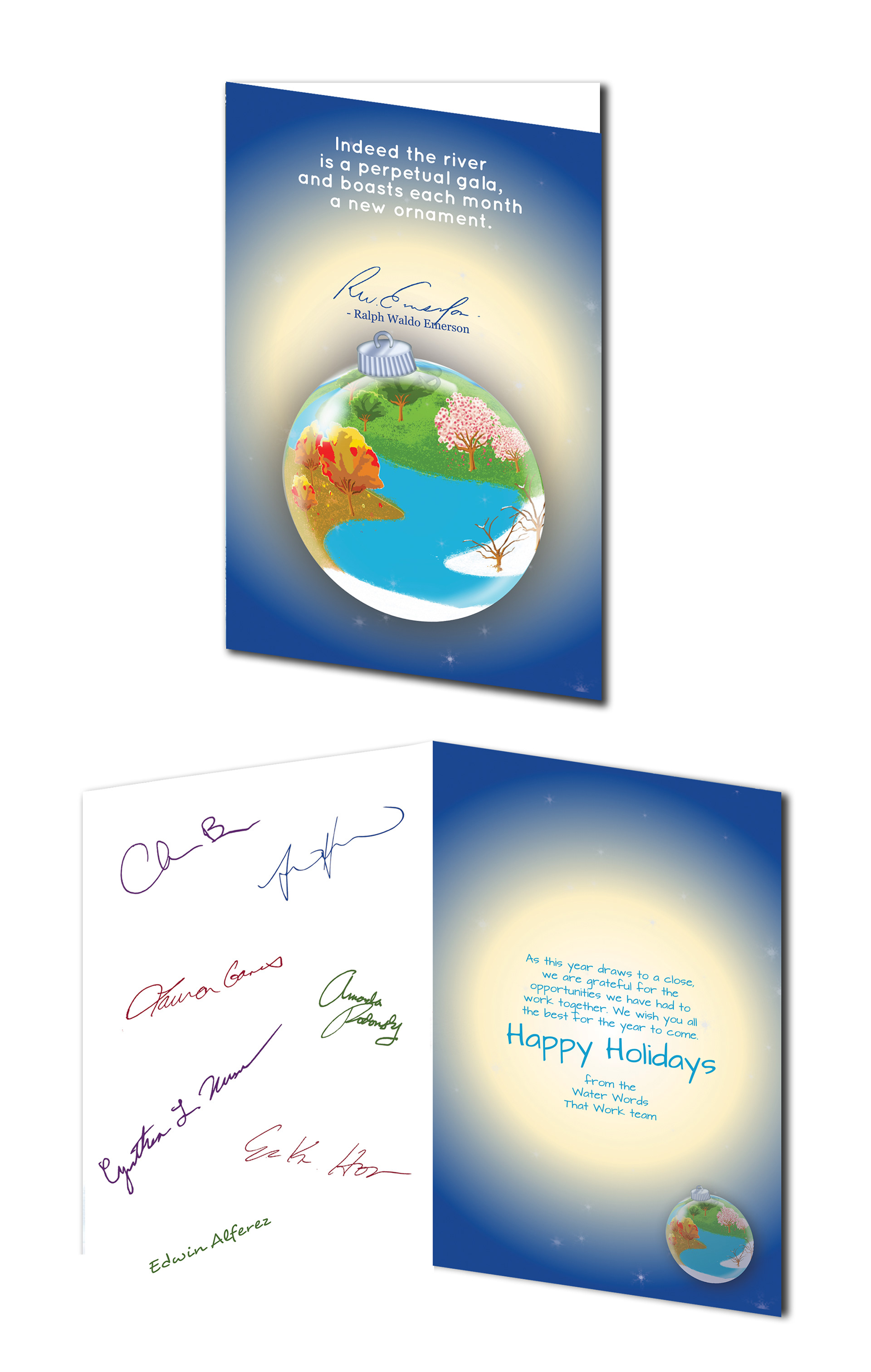
2019 Holiday Card for Water Words That Work (Adobe Photoshop)
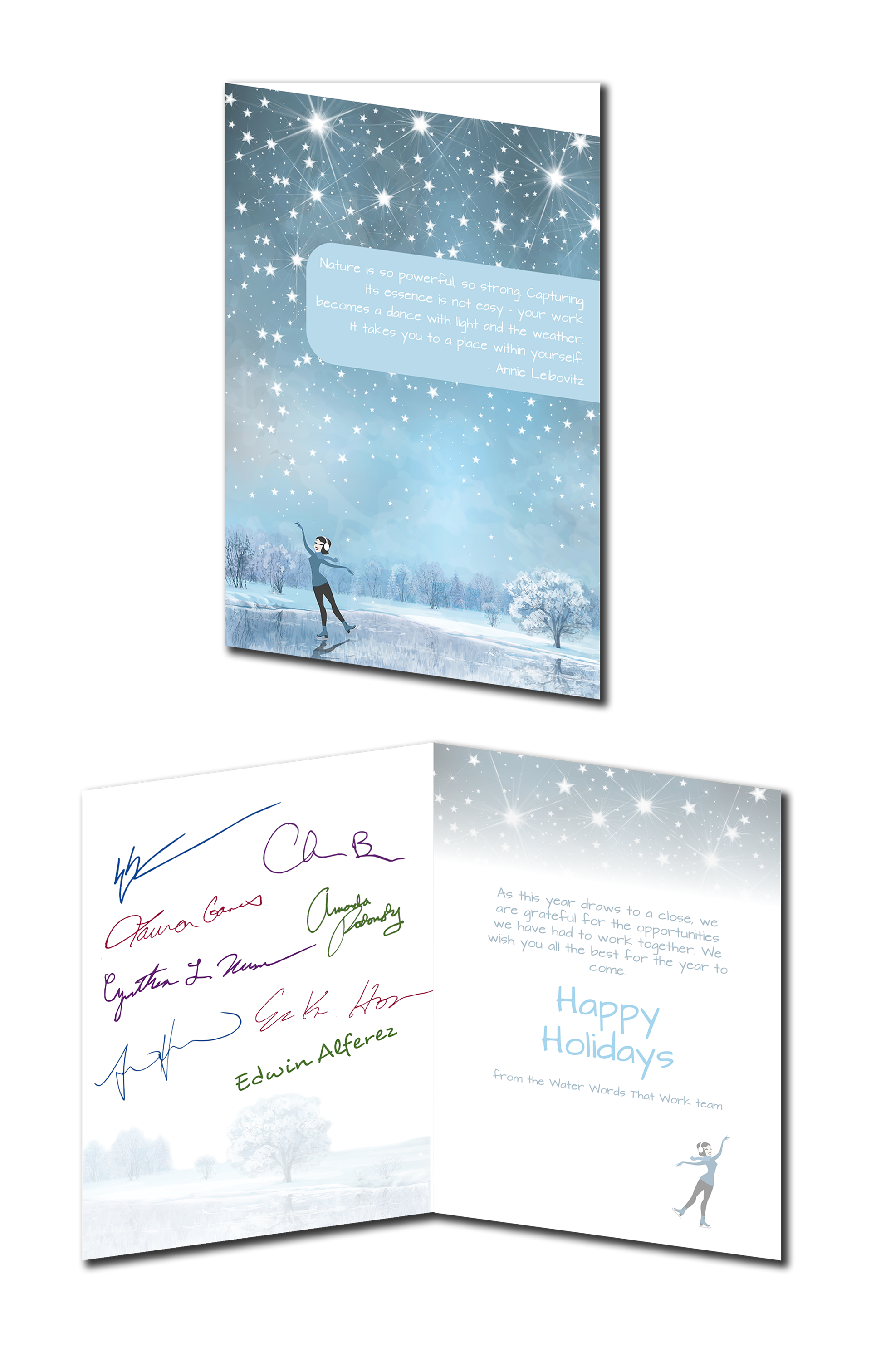
2017 Holiday Card for Water Words That Work (Lucidpress/Adobe Photoshop)
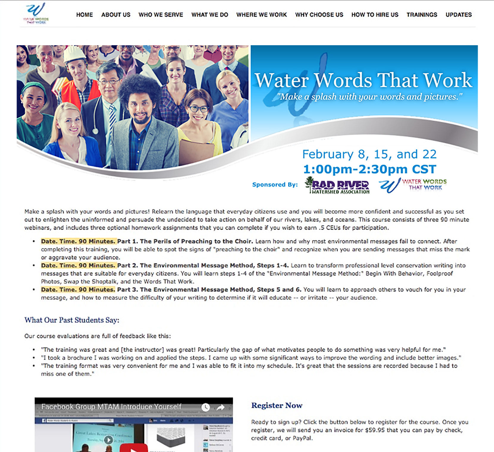
Web Banner for Water Words That Work Training Events (Lucidpress/Adobe Photoshop)